Web Design

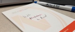
Website Launch: Red Panda Web Design
The goal of Red Panda Web Design was to provide All in Web Pro clients with a lower cost option for website design services while also allowing us to add diversity to our design process. To help achieve a low-cost solution for Las Vegas Web Design clients in need of a professional web presence we turned to the SquareSpace platform and discovered its unique set of features and quick deployment options were a great fit for this web design price-point range. The Red Panda Web Design website became the homepage for this new service offering. We also wanted the site to stand out visually and because of the specific audience and our desired conversions we used a visual style that was inspired by some of our favorite 2017 design trends.
The entire process for the site began out of a brainstorming session looking to find a way to provide a quality web design product to a client with a $600 - $1,200 website budget. From here we created the baseline price-points and an outline of the steps target clients would have to take. This was then expanded on and worked out into 3 different web design packages with 3 add-on services (i.e. Content Writing, Logo Design, and Business Cards) that are offered for any new website.
To create a site that appeals to everyone while also showing off our design skills, a few techniques were used; such as image style treatments and the use of bright colors and gradients. All the headers of the main pages contain a hero image that was processed through photoshop to not only have an optimized file size for web but to also apply a slight purple blur to help overlaid text stand out. The buttons and menu bars feature the same Yellow to Pink to Blue gradient; using the gradient also helped created brand consistency. The site was built on the SquareSpace.com platform to best demonstrate some of its capabilities and design elements we can offer our clients.
Overall the site came together well based on our goals and the design is something we are looking forward to getting feedback from our visitors. The site allows us a way to offer a new beneficial service to let us deliver fast and well designed websites clients on a tight budget who are looking for cheap web design services that are still professional and reliable.

Optimizing Images for the Web
It’s been proven that web design with more visuals and graphics tend to be more effective than those without. Unfortunately, graphic design is more complicated than simply dropping photos or images onto a web page. Before you start changing your website’s graphics, be sure to check out these tips for implementing photos in your web page designs.
Making sure to use images to capture an audience is important but so is not losing your clients due to slow load times because of poorly optimized images. Most users only wait around 3 seconds before leaving a webpage on desktop because of slow loading images and only 5 seconds on mobile devices. Follow these 3 tips to help ensure you don’t lose clients due to poor image optimization.
Optimize Image Sizes:
Web pages are designed on a foundation of millions of pixels. This topic is just as important in graphic design and the choice and selection of photos, because if an image isn't designed to be large enough for the space it’s meant to occupy, in most cases it will look pixelated and lose image quality. When an image is too big for the space it's meant to occupy it can take add excess file size weight to a webpage slowing down load times for both desktop and mobile-users. It's possible to also over-optimize and make a image low quality in exchange for faster load times. It's therefore extremely important to optimize your photos correctly for the web.
Avoid Generic Images:
Visitors to your webpage are already very familiar with visiting a websites and perceiving whether a webpage is professional or assembled cheaply. When it comes to graphic design, your website visitors may recognize certain very commonly used stock images. If you don’t want your company to be interpreted as generic, we recommend avoiding using the most popular stock images or very generic looking images that visitors might already recognize because they are already used on thousands of other websites across the internet.
Invest in Professional Photos:
This is a costlier solution to the problem mentioned above, but it will be well worth the investment. An investment in professional photography will draw the eye of your website’s visitors and create a stronger emotional connection to the written content on each page. Conversely, photos of poor quality or photographs that have little or nothing to do with the unique text content on each webpage is arguably worse than having no photos at all on a webpage.
Take your time to get your website right. Ask for help from professionals when you need it. Optimized photos on the web give your online presence something more unique and memorable for visitors, and when done by a professional agency that does both web & graphic design it will usually increase your search engine rankings, or SEO, as well.
If you need a trusted Las Vegas web design firm that takes graphic design seriously, look no further than All in Web Pro. Our experienced design team will work with you to find your brand’s voice and help you put it onto the page. If you are ready to take your brand to the next step, contact All in Web Pro today.
4 Easy to Avoid Web Design Mistakes
As a small business, your website is of the utmost importance. When visitors make it to your website they are coming for a specific reason and you want to be sure that you can quickly, and efficiently, provide them with a solution to their needs. If your website design is flawed and difficult to navigate, your company could be missing out on a lot of potential leads and ultimately revenue. Here are a few mistakes to avoid in your website design so you can maximize your website’s effectiveness and provide a positive experience to your customers.
1. Understanding Your Target Market:
Many companies make the mistake of not properly understanding their target audience and the different types of customers that fit that description. This often results in web designs that are not optimized and don't work properly for the audience they are trying to attract and engage. Figuring out your target demographic can be extremely helpful in determining the website design approach that works best to give visitors a positive experience while they are using your website.
2. Having an Unclear Call to Action:
What is your goal once users have found your website? Be sure to direct your visitors clearly to this goal. Help show them where the next step is through a concise and prominent call to action. One of the best ways to do this is to first ask yourself what the quickest and easiest way is for visitors to get value from your product or service, then create a call to action (CTA) that helps you quickly give the customer access to that value or collect their data so you can deliver it to them right away.
3. Stale or Boring Content:
Users want your website’s information to be the latest, most up-to-date content available. If your website has very old content that hasn’t been updated, many customers may assume that you are being the times or might not have nice services or products. Additionally, content that is not very valuable, uninteresting, or not engaging can make your visitors lose attention and click away. Work on a way to write your content in a professional but appealing manner that is easy and interesting for your target audience read and stay interested in or want to come back to read more later.
4. The DIY Route:
Your website is the best way for you to interact with your customers. You want to be sure you make your web design, layout, and content choices a priority and make sure there are reasons behind why you made the design decisions you did. A website designed without a professional web and graphic designer involved can potentially lead to mistakes or missed opportunities that result in a loss of revenue due to your customers leaving your site early or not finding what they wanted to, being unimpressed with the design, or not being as engaged as they could have been. A bad design can negatively impact your customers' thinking by making them associate your services and brand with an unprofessional appearance.
These points are just a things to keep in mind to help you avoid a major problem with user experience in your company’s website design and content. It is especially beneficial to make your customers happy and that applies to their experience with your company not just in person but online. If you need some help or have any questions feel free to contact us and we will be happy to help you any time.
If you have questions or are thinking about making a change in your business’ web presence don’t hesitate to contact All in Web Pro for a professional consultation today.

Las Vegas Web Design: Best of the Best DJ's
The owner of Best Of The Best DJs, one of the most award winning DJ Companies in Las Vegas specializing in weddings, birthdays, reunions and corporate events asked the All in Web Pro team for help with Las Vegas Web Design services for his new website re-design. He had had several bad experiences working with other web designers and was very hesitant about our design process and the ability to have revisions made before the project is complete. We reassured him that we are a professional web company that works hard to ensure our customers are fully satisfied with our services at the completion of any web design project.
The client needed a website design that would highlight their many awards from The Knot and other wedding and DJ related review websites. It was unique that he had over 100 video testimonials from wedding couples who have worked with him! He already had an existing old website that had a decent amount of text content that we could use and over 100 video testimonials that we could use.
We took the content from the original website and reworked it into a new updated look and feel that was fun and visually stimulating. We used WordPress as our foundation and built all of the requested features within a highly responsive and customized WordPress theme that was easy to maintain and expand. We added custom forms and after making a lot of small adjustments to text and images we arrived at the website he has today.
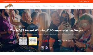
The client was very excited and happy to see that even after the first round of development the website pleasantly surprised him and exceeded his expectations for Las Vegas web design services compared to his prior experiences and the very modest price of the services. The client was so happy with the result and the value he received for the price he wrote the following testimonial for us.
We have worked with other web designers in the past and were never satisfied with the end result. The lack of creativity and the lack of knowledge in building the site has always been an issue.
This time around we hired All In Web Pro and they did a great job. They were professional from start to finish, easy to work with, and knocked the design out of the park on the first draft. Check out our website and see for yourself. Highly recommended.
If you're in Las Vegas and are in need of a great DJ that comes with a high level of recommendations and accolades, be sure to check out Best of the Best DJ's for your next event!

Las Vegas Web Design UI Trends in 2017
With every passing year, new trends and patterns emerge and become apparent in web design around the world. As the use of theme market places and templates becomes more commonplace in web design, and advanced design elements become more popular, many web designers are more and more using the same user interface (UI) elements. The high popularity of the WordPress CMS platform and theme marketplaces to purchase highly advanced WordPress templates, certain common UI patterns are becoming extremely common and easily recognizable. We have seen these used not just in Las Vegas web design but for businesses and brands everyone.
Here are the top five commonly seen UI patterns in web design.
1. The “Hamburger” Menu: Currently most people are familiar with those three horizontal lines that appear so often in the corners of web pages. This is the most common way to minimize navigation menus to fit on smaller screen sizes so they are not obtrusive to the user's browsing experience.
2. Multiple full-screen sized elements: Apple.com may not have been the first website to use this technique for displaying content, but it has certainly popularized it. The tech giant known for selling their high quality mobile phones and hardware helped popularize this web design trend which is characterized by using full-page sized images, minimal text blocks, and clean open layouts. When you scroll down a webpage and notice that it is divided into individual sections that are each focused on a single product or service and you need to scroll down an entire page length to see another similar section that uses large images and a small amount of text, then you know what we're talking about.
3. The Long Scroll: At this point, placing most of the important elements of your web page above the fold (part of your webpage seen first by visitors) is common knowledge. A great way to add more information to your homepage is to utilize a long scroll layout style, which people are getting more accustomed to seeing thanks to their popularity on mobile devices.
4. The Card Layout: Pinterest and Amazon users will be familiar with the card layout used by these popular websites. Cards are becoming a popular format due to their ability to display small snippets of important information in small chunks. The best part about the card layout is that their rectangular shape makes them simple to rearrange as your design dictates.
5. Heroic Imagery: A powerful image on your website’s home page is one of the best ways to grab the attention of your visitors. The most common pattern we’re seeing in website design is to add an eye-catching hero image at the top with a card-based layout underneath it.
Your website design is key to your user’s experience with your brand or business. While these trends might not seem like the most unique way to grab people’s attention they are tried and true working methods that have been tested millions of times and either receive positive customer feedback or have been shown to improve conversion rates for desired customer interaction goals.
For more on how to get the most out of your website design, check out the services we offer at All in Web Pro.

Google Can't Pass its Own Mobile-Friendly Website Test
I do a lot of website testing
As a Las Vegas web designer I'm constantly on the look-out for new trends and ways to improve website performance. I pay attention to Google announcements, tech blogs, and am always on the look-out for new easy ways to measure the health of websites, security issues, and website performance. One easy kind of tool I like to use sometimes are automated website checkers. Some website checkers will tell you how many pages your website has, some will measure an abstract performance value relating to Search Engine Optimization (SEO), others will tell you how fast your website loads in browsers, and others will give you helpful suggestions on ways to improve your website to remove technical errors in the code or out-dated code usages which should be updated for best browser compatibility.
Google Adwords told me my website had some errors
So recently while checking my Google Adwords account, which is a service created by Google to help website owners advertise their website in Google Search results, I noticed an alert posted about our company's website AllinWebPro.com. Adwords was alerting me that some of the pages that visitors see after they click on our ads aren't totally mobile-friendly, and that there are still some errors occurring that we might want to address. So I clicked on the link and it took me to Google's mobile-friendly website test tool. Here you can type in the name of any website for Google to search and then see what results or errors it finds that you might be able to easily fix to improve the user experience for mobile viewers of your website. This is a useful tool in many ways.
Hello Google's Mobile-Friendly Website Test Tool!
I wasn't sure if the errors it found were important
But when errors appear that aren't very clear, such as scripts or images that might be intended to appear when your website responds to a mobile browser, it would help to know whether or not we should be alarmed and take these warnings or errors seriously. Are these problems that are stopping visitors from using my website? Should we quickly contact a specialist to see if we can optimize our website to make it load .01 seconds faster to help improve the user experience or rank better in search results?
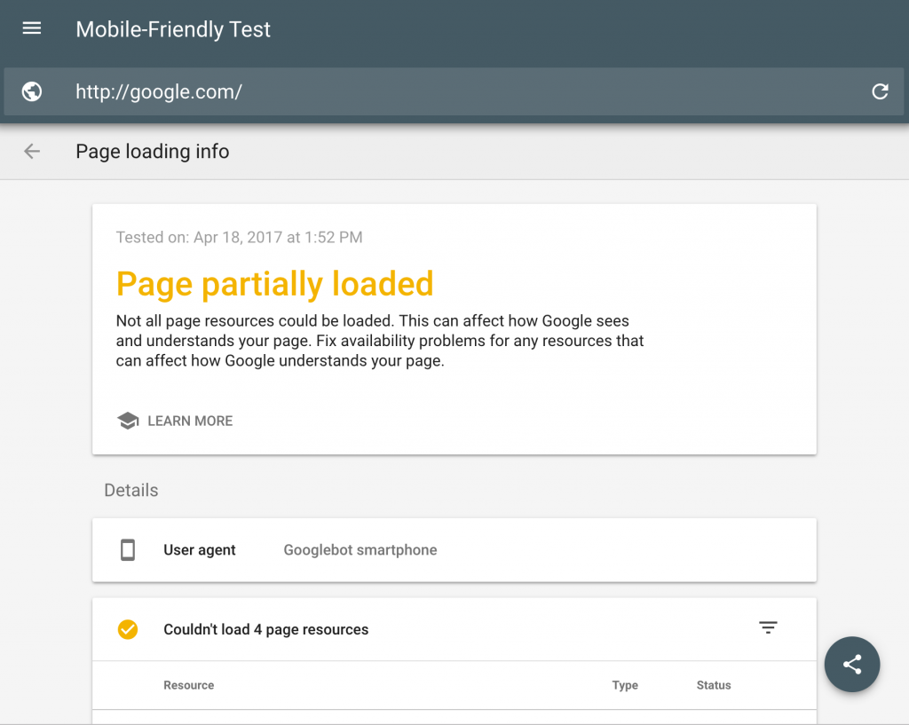
So I tested Google's homepage in their own test tool
To better answer this question I thought I'd be cheeky and enter google.com into its own mobile-friendly test tool. And the result is a little interesting, if not surprising. There were about 4 errors that Google's own website scanner detected on Google's own homepage! Apparently Google had some scripts that couldn't be accessed and there was some kind of URL redirect error occurring. Don't ask me about how to troubleshoot Google's own errors though, I'll leave that up to Google. But it was quite an interesting result considering that you'd think Google would be an authority on perfectly optimized website conventions and that they would have used their own tool to remove any errors they might have had. Or that if they saw that their own tool was producing errors for their own website that they'd endeavor to either remove those errors, or if they weren't really errors to change how the error detection in the automated test program to remove those kinds of errors from the list so they don't appear for the average user.
I noticed Google had 4 errors on their own homepage...
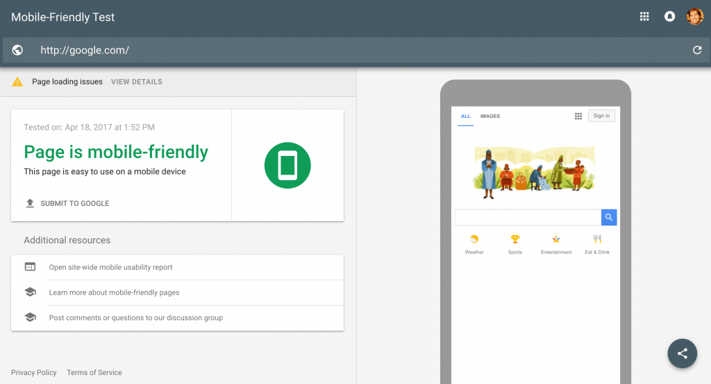
And I could see what the errors were...
When Google doesn't pass its own Mobile-Friendly Website Test
The results of doing this test on Google's own website in Google's own tool is that these mobile-friendly tools don't operate by having a team of real people somewhere loading up your webpage every time you submit a website in their tool to be looked over and reviewed, but really just a machine that is prone to making mistakes and mis-identifying errors that might not really be errors. The results you see from any automated website scan is simply a program that one or more web programmers wrote that was designed to detect specific conditions that occur based on the specific knowledge of how websites, website programs and scripts worked at that specific time, and it's not possible for those programmers to be able to account for every possible variation of program or script that websites might have. They could only do their best to write a program that would hopefully provide some helpful information to whoever uses it.
Website scan tests are just programs, and their results aren't always useful
It was clear that one condition the creators of the test programmed into this site scan is to detect if a website uses some form of web address (URL) redirect, another is whether certain scripts listed on the page are actually being loaded or not. But even if a script isn't fully loading it's not always a critical problem, maybe the person who built the script didn't mean for it to load the first time someone visits the webpage, or maybe they didn't intend for it to be activated on mobile devices, or they wanted it to only be triggered by some kind of human behavior like a mouse-over instead of by a robot in a Google Mobile-friendly test program script that's just reading it.
Conclusion, website scan tools help, but aren't the best authority
The bottom-line here is to not take the results of all automated site scan tools as the definitive judge of whether or not your website is having serious problems or errors that need to be fixed in order for your website to function correctly. It's possible the tool might be identifying problems that might not actually be problems, or it might be falsely leading you to a state of anxiety about something that isn't really an issue. It's always good to consult experienced website specialists to ask them how your website might be improved or optimized. But just because a website scanning tool says your website has errors, yes even Google's, it doesn't necessarily mean there's a major problem happening or that your website is broken.
Learn more about Google's Mobile-Friendly Test Tool
I also clicked on the help section for Google's mobile-friendly test tool to see what other information I could find on it, which you can also read here in case you're interested.

Traits of Professional SEO Web Design
Not all Web Design is SEO friendly
When it comes to professional web design, there are lots of great web designers out there. Most web designers are very creative and have a strong artistic background. These designers can use their artistic abilities to design websites, which are guaranteed to catch the attention of your visitors. However, there's one major factor that the majority web designers are lacking.
Many web designers are usually not familiar with the concepts and implementation of search engine optimization (SEO) techniques. Even if a web designer has at least some fundamental knowledge and understanding of SEO, the majority don't worry about implementing search engine optimization strategies into their designs.
Include SEO in your web design conversation
While the implementation of SEO into your web design might seem like a trivial detail, it can be the root of some major problems. No matter how aesthetically pleasing or engaging your website is, if it's not indexed by or optimized for search engines, such as Google, Yahoo, and Bing, it might not receive any visitors from organic searches. Once you realize your website hasn't been indexed or isn't ranking well in search engines, you will probably need to hire an SEO expert who knows how to update your website to be optimized for search engines.
In the end, you could find yourself paying double for something that should have been done the first time around. Whether you're a web designer or a business owner looking to hire a designer, it's essential to know the three traits of professional SEO web design.
1. Human & Search Engine Usability:
The first trait of a professional SEO web design is usability. The website must be easy for visitors to navigate and be easy for search engine robots to crawl and index. Making your website friendly for human visitors, search engine robots, & search engine algorithms requires minimizing or removing things to ensure that your website is setup for success. When a website is designed with usability in mind, you can be certain that both your visitors and search engine robots will be happy with your website.
2. Follow Search Engine Guidelines:
The second trait of a professional SEO web design is that it follows the search engines webmaster guidelines. Web designers are typically very creative individuals and tend to push the envelope in terms of designing websites. This mentality can result in some amazing web designs; however, it may also create problems when taken too far. It's alright to push the web design envelope; just make sure that the web designer avoids anything that the various search engines advocate against.
3. On-Page SEO Optimization:
The last trait of professional SEO web design is on-page search engine optimization. Out of our three traits of professional SEO web design listed here, this is the most important. On-page SEO is the foundation of a professional SEO web design. It's crucial that the web designer properly implements things such as the page title, meta description, H1 and H2 tags in addition to internally linking between pages. If the web designer takes the time to apply these practices, it will make a significant difference in how and where your website ranks in the search engines.
All in Web Pro is the leading Las Vegas web design and SEO company. We understand that your website is the face of your business on the web, and we'll ensure that you're delivered a professional SEO web design solution that will engage your audience and make the most of the best search engine optimization techniques available today.

Nevada Volunteer Research Initiative: Website Launch
The Nevada Volunteer Research Initiative (NVRI) started in 2014 wanting to provide information about volunteerism in Nevada and how to improve it. In 2015 they conducted a survey revealing details on the people who are volunteering and what motivates them to offer volunteer. They took the collected data and combined them into a report to share with colleagues and partner organizations. UNLV Professors Dr Jennifer Keene and Dr Takashi Yamamashita, both key members of the NVRI team, approached our Las Vegas Web Design team at All in Web Pro to come up with the best way to share their findings in a visually engaging online website that everyone could easily access. To help the NVRI we came up with a branding solution for a digital and print campaign to promote themselves and the survey; by creating a website, brochure, and redesigning the reports presentation.
The first concern they had was while they themselves were credible professors they needed a way to visually communicate the value of the data and establish the report as a reliable and legitimate source of important information at a glance. Their branding which included the logo design needed a combination of professional appearance mixed with bringing a sense of warmth and caring to reflect the philanthropic tone of the subject of their research, community volunteerism. We used a combination of traditional type fonts with a simple yet effective illustrated icon. This clean and modern style of drawing were carried throughout the rest of their branding assets.
The NVRI website was built in WordPress with a custom theme featuring CSS3 animated bars to make report stats visually appealing. You can visit NevadaVRI.org to learn about them and their findings. You can even view a copy of their 2015 report which we designed.

10 Popular Web Design Elements
At All in Web Pro, we're passionate about empowering businesses and brands to reach their full potential using digital technology. It's important that you find a Las Vegas web design team that will help you develop the right kind of website to satisfy the needs of your business or brand. Anyone who has a website or wants to build a new one will benefit from having a better understanding of web design concepts and elements. There are a few different kinds of popular design elements that are being using by many web designers today which you should understand and keep an eye out for. Here are ten web design elements that not only deserve your attention but that you may want to consider including in your next web design venture.
1. Single Page Websites
Many websites you'll find today stack all of their content onto a single webpage, so that most or all of the navigation links send you down the page to the corresponding content instead of taking you to a different webpage address. Doing this has some benefits, including ensuring that regardless of whether a user prefers to scroll down or click first they are always going to be seeing the same content, or at least will be less likely to miss content on a separate page if they only scroll down, or at the bottom of the page if they normally click on links in the navigation menu. This design style typically isn't used for websites with a high volume of content that is better suited to a multi-page website.
2. Parallax animation
Parallax animation, which can be roughly defined as an animation that responds directly to scrolling up or down a webpage, can be a minimal fancy design feature or an integral part of the user-experience (UX). Use of parallax design can create a more fluid and pleasurable experience for a user moving up or down a webpage when done correctly.
3. Cinematic
The names says it all. A website of this genre provides an immediate or large heavily visual experience designed to captivate and engage the audience, often with a full-screen image or video. Users, believe it or not, will judge a web design by its "Book Cover", which is another name for this particular type of web design.
4. Flat design
Don't let its label fool you. Manageable and scalable, flat design is less about the flash and more about the ease of use. This style of design has become dominant over the past few years and is characterized by a lack of texture or depth, and removal of 3 dimensional visual elements. Think of the Windows 8 or 10 layout for example.
5. Background video
Video is the most engaging type of content on social media today. Video has been proven to get more clicks, likes, and shares than photos or text. Adding video as a background element to any website, when done correctly, can add a layer of context and atmosphere that can add to the user's experience as well as the professionalism of a webpage's presentation. It is probably best used on webpages with a minimal amount of other content and layout elements.
6. Tiles
It's not just for the people who like squares and everything in its place. This web design is for online users who are familiar and fascinated with the new Windows 8 interface.
7. Mobile-First
Mobile-first is when a web design is created first to create the best possible mobile experience, and then secondarily adjusted for appearance on desktop screens. Over the past few years a shift took place as mobile internet browsing surpassed desktop use. That means that now the majority of website users are using a phone or tablet to access webpages.
8. Minimalism
Sometimes less is more. A site with this particular web design utilizes small fonts or minimal text within larger visually oriented webpages with fewer navigation options and fewer layout elements.
9. Google Maps Integration
One-touch Google Maps tools allows on-the-go audiences to quickly pull up a location on Google Maps. More and more users are accessing websites through mobile devices these days and helping them find your business quickly and easily is more important than ever.
10. Widget Navigation Menu
Menu widgets are useful elements that keep the navigation buttons in the same location on the webpage regardless of how the user scrolls. This is more for improving the user-friendliness of a webpage than enhancing design aesthetics. With widget navigation, or "sticky menu", audiences will be able to navigate around your website a little more easily and quickly to find the information they need.
Want some insight for how you can use one of these favored elements in your next big website change? Whatever your web design needs, All in Web Pro provides the professional and creative components your website requires.

Epic Food Blog Website Launch
Epic Food Blog was the idea of private chef Kevin Noar who needed to have a blog to showcase and share his recipes online. Each of the recipes contained in the blog feature many high quality imagery to help the reader see how a dish is created step by step. A modern, clean, and simple style was chosen to ensure that the content would be the main focus for site visitors and some serif style font called Playfair Display was injected for headings. Each recipe post on the Epic Food Blog website has the ability to be optimized for either web viewing, Pinterest sharing, or a custom printer-friendly card style layouts. To help Kevin achieve the most out of his website we provided one-on-one training on everything from WordPress admin functions, social sharing, basic site analytics and SEO best practices.
Epic Food Blog is a self-hosted WordPress site featuring a highly customized theme we styled and edited specifically for Epic Food Blog. The site also has several social sharing tools integrated directly into both the WordPress back-end. Make sure to have a look at the Epic Food Blog and download some recipes for your next meal!
When looking for a Las Vegas Web Design company contact All in Web Pro for your next website project and let your vision become reality! 702.306.6455