New Website Design
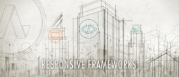
Responsive Design & Why it is Important
/** This is an example of a media query that will activate if your screen has a width of up to 680px; It will then (and only then!) apply the contained CSS. */
@media screen only and (max-width: 680px) {
    .someGridElement { max-width:50%; }
}
/** The below media query only applies to view sizes above or equal to 680px width.* Setting it to 681 is so that we don’t have overlapping rules.*/
@media screen only and (min-width: 681px) {
    .someGridElement { max-width:25%; }
}

Creating a Good User Experience
- Get feedback from friends, family, A/B testing, page analysis tools, and anything else you can get your hands on. These are crucial for any high-end or high traffic web design project.
- Keep your design consistent. Reuse design elements to give a sense of unity. This means, stick to your colors and light/darkness percentages.
- Make tasteful use of animation. Tasteful is hard to define, and it is ultimately left up to you, but find an animation that works for you and the functions that your application performs. Smooth movement is great eye-candy, and will reinforce the feeling of completed an action or creating a sense of progress as users navigate through your site.
- Make use of load times, but keep them short. Having an animation or smooth transitions will reduce the perceived load time, and making things load quickly will help retain users and make sure that they do not get bored or impatient.
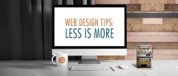
Las Vegas Website Design Company Tips: Less is More
As a Las Vegas Website Design Company we like sharing tips to help you improve your online business and brand. As Google and user behavior has evolved over the past few years, the theme of 'less is more' has never been so important as it is today. A website with too much clutter can become difficult to navigate, while a more stripped down look can appear more sleek and modern. This direction of minimal and simplified web design has been trending for a while now, and it's important to take the potential benefits of this design philosophy seriously. Here are a few tips on how a more simple website design helps improve the user experience of your visitors.
1. Only the Essentials:
One of the first things to do when seeking improvement in your website design is to limit your website to the essentials. The process of trimming down the website can be a challenging one but is definitely a process worth some attention. A good rule of thumb to follow is the 80 - 20 rule, which states that 20% of what’s on a page should give 80% of its value. Consider what content on your pages are most essential and where you want your visitor’s attention to really be.
2. Number of Pages:
Having enough pages on your website is important for SEO purposes, however, along the same lines as what’s been said above, you don’t want to go overboard. You want to make sure your website design is user-friendly, don’t make it too difficult for your visitors to navigate by giving them too many choices of where to click to find what they need, it might make them not want to return. One way to still have lots of pages and content while still keeping your web design clean and organized is to utilize categories and sub categories within your main site pages and blog to minimize the number of options a user is presented when first deciding where to go to find what they’re looking for.
3. Consider What’s Above the Fold:
When a user loads any page your website, the first things they see is the area of your website usually referred to as “above the fold”. This refers specifically to the area of your website that appears in a user's browser before they scroll down. This area often changes depending on the size of the browser window you view a website on. But being aware that this area is the first impression your visitors see, it’s best for a website’s design to carefully consider the first impression and type of content you want your visitors see at first glance. Although it’s been shown that most users naturally scroll down webpages to view additional content on websites, it’s important to consider what information, media, or call-to-action you want your visitors to see first. It could determine whether they stay or click-away.
4. Fewer But Carefully Selected Colors:
Don’t go crazy with too many different types of colors for your website design. When in doubt, find a small handful of colors and stick to those, anything else may become a distraction or complicate the user’s visual experience. Consult with a professional web & graphic designer when selecting your website’s color scheme and background elements.
If you need a trusted, Las Vegas website design firm, look no further than All in Web Pro. Our experienced web and graphic design team will work with you to find your brand’s voice and help you translate it onto your webpages. If you are ready to take your brand to the next level, contact All in Web Pro today.
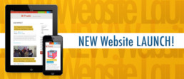
New Website Design: Prakti - Changing the World with Cookstoves
Changing the World
PraktiDesign.com is the website home of Prakti, an exciting new social venture startup that's working hard to develop innovative technology that will significantly improve the health of women and children in developing countries. Their innovation is clean cookstove technology! They've created an advanced cookstove system specifically designed to be affordable for mass distribution in the developing world, and they've already begun operations in India, Haiti, and Nepal. Most people wouldn't think smoke from a cookstove could be such an important issue, but it's one of the top 5 killers in developing countries today, causing over 1.9 million premature deaths every year mostly among women and children who cook food in covered indoor stoves which release harmful particulates into their homes.
Owen Carver had the opportunity to meet the founder of Prakti, Mouhsine Serrar, last year at the UnReasonable Institute in Boulder Colorado during the 2 days leading up to the UnReasonable Climax event. The Climax is a startup stage where 25 entrepreneur graduates from the UnReasonable Institute's 6 week program present their for-profit social ventures to a packed audience of academics, investors, and like-minded individuals passionate about changing the world.
Prakti was one of two startups presented that received awards from Siegel & Gale, a global strategic branding firm based in New York, which entitled them to receive free banding services from the firm along with a blue-print for a new website. After some time Prakti reached out to All in Web Pro for help with the execution of these brand strategies through the redesign of their website.
While working closely with Prakti and the Siegel & Gale team, we generated an modern interpretation of this new user-friendly and easy to navigate website aimed at providing key information to investors and partners through a story-based content system designed for easy ongoing maintenance and expansion.
We're proud to be able to support Prakti in their mission to change the world through innovative cookstove solutions and are honored that they look to us for their web design needs.