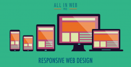
responsive design

Responsive Design & Why it is Important
/** This is an example of a media query that will activate if your screen has a width of up to 680px; It will then (and only then!) apply the contained CSS. */
@media screen only and (max-width: 680px) {
    .someGridElement { max-width:50%; }
}
/** The below media query only applies to view sizes above or equal to 680px width.* Setting it to 681 is so that we don’t have overlapping rules.*/
@media screen only and (min-width: 681px) {
    .someGridElement { max-width:25%; }
}

Creating a Good User Experience
- Get feedback from friends, family, A/B testing, page analysis tools, and anything else you can get your hands on. These are crucial for any high-end or high traffic web design project.
- Keep your design consistent. Reuse design elements to give a sense of unity. This means, stick to your colors and light/darkness percentages.
- Make tasteful use of animation. Tasteful is hard to define, and it is ultimately left up to you, but find an animation that works for you and the functions that your application performs. Smooth movement is great eye-candy, and will reinforce the feeling of completed an action or creating a sense of progress as users navigate through your site.
- Make use of load times, but keep them short. Having an animation or smooth transitions will reduce the perceived load time, and making things load quickly will help retain users and make sure that they do not get bored or impatient.
How Responsive Web Design Can Benefit Your Business
What is Responsive Web Design
Responsive web design is more than just the latest trend in web design. If you live in the digital world, you’ve probably already heard of it and may have seen it used on many of your favorite websites in the last few years. If you haven’t, responsive web design is the approach to designing websites in which the content automatically self-adjusts to your screen or device size for optimal view.
This allows the website to adapt its contents to your screen or device, positioning the content in the best possible way, changing the size, shape, and relationship between the various elements on a webpage. Responsive web design is also sometimes referred to as “mobile-friendly”, or “mobile-ready” web design. There are a variety of ways for a website to be responsive from a technical coding perspective, but the end result is that you the webpage you look at will change as you adjust the width of your web browser screen either by changing the orientation of your mobile device from horizontal to vertical, or by dragging the edge of your desktop browser sideways to make your browser window more narrow horizontally. (Hint: Try it with this webpage and see if you can find everything that changes.)
Before Responsive Design
In the past, businesses would need to hire a designer to make different versions of their website if they wanted it to be usable on mobile devices. These would usually include a version for desktop users, mobile phones and maybe even a tablet version. However, with a growing plethora of devices users were able to browse the internet on, this quickly became a difficult strategy to implement. With responsive design, you have only a single website that automatically adjusts its contents and layout to fit whatever screen size or “viewport” it’s being viewed on.
How Can Responsive Design Help Me?
Now that we understand what responsive design is, the next question might be how can responsive design benefit your business? One of the biggest ways responsive web design can benefit your business is improving your ability to reach the large audience of mobile device users in search engines. Over 80% of adults in the United States own a smartphone with internet access, and reports show that mobile devices accounted for over 60% of website traffic in 2014. The mobile device market is growing every day and as more people adopt these devices we will only see these numbers grow.
Responsive Design Improves User Experience
If you sell businesses products or services online, you should be concerned about how you can increase your sales or increase the conversion rates of your website. Responsive web design will also make your website look better, be more user-friendly across different devices and provide a consistent user experience. In turn, this will help drive sales and have a positive impact on your conversion rates. In short, having a responsive web design can actually help you sell more of your products or services and make more money as well as make your website easier to use.
Google Demotes Non-Mobile-Friendly Websites
Google also has stated that they are going to begin demoting websites that are not deemed “mobile-friendly” in its search results for people searching on mobile devices. You can test whether your website is “mobile-friendly” according to Google by visiting Google’s Mobile Friendly Test page and submitting your website address there.
Streamlining Web Design Updates and Maintenance
Another important benefit of responsive design is that it can actually save you time and money. Designing a responsive website is faster than creating separate stand-alone websites for mobile viewing and will save you money when it comes to your development, support and maintenance overhead over time. The good news is that most website themes built today are responsive by default, and is now considered the norm in website development.
About All in Web Pro
All in Web Pro is a leading Las Vegas’ web design company. We understand that your business depends on staying connected to your clients, and we’ll ensure that you’re delivered a professionally designed website that will engage your audience, showcase the best you have to offer, and deliver results for years to come.

How Mobilegeddon Affects Your Website & Business
What is Mobilegeddon?
Google’s new mobile update, dubbed “Mobilegeddon” by internet marketers, has far-reaching implications for both your website’s SEO (search engine optimization) and your business. Mobilegeddon’s affects, which began in April of 2015, had a negative impact on the search result rankings of websites that are not mobile-friendly. However, for the long term, Google is making a clear statement that mobile devices and mobile search are becoming a critically important aspect of digital commerce and internet use in general.
Mobile Use is Sky-Rocketing
In the last few years, mobile device and tablet use has been skyrocketing to record numbers year over year. In 2014, statistics showed that the use of non-desktop devices, such as tablets and mobile phones, outnumber PC’s online. Although mobile devices have not yet surpassed desktops in the amount of searches on Google, smartphones are quickly approaching desktops in search. These days, nearly 90% of purchases for local goods and services are first researched online through search engines and more than 70% of business traffic is driven by search.
Search is extremely important and valuable to businesses, and trends are moving towards mobile search as the primary digital mode of the future as more people use their phones and tablets to search for products, solutions, content and more. Consider how many times you’ve used your iPhone or Android device to search for a local restaurant or business in your city, or perhaps while you were in a store and searched for reviews or prices of a product you were thinking about buying.
Google is Constantly Updating
Google is highly aware of these trends and is constantly testing and analyzing user behavior to deliver higher quality results and a more user-friendly experience to Google searchers. They are always looking for ways to connect users with the most relevant search results possible while also providing a improved user experience across all devices.
Responsive & Mobile-Friendly Web Design
Responsive web design refers to websites that respond dynamically to the size of the web browser that they are displayed in. Websites that are responsive can change in a variety of ways by adjusting their visual elements including font, images, layout positioning, and relationships between elements in different ways on the fly without requiring the web browser to be refreshed. This can be easily be observed by adjusting the width of the browser window you are viewing. Common elemental changes in a website that is responsive include the morphing of menus into a button with 3 horizontal lines, the vertical stacking of images and layout elements that were previously in rows, and the adjustment or removal of large elements in order for them to still fit on the webpage.
Responsive Web Designers
All in Web Pro is a leader in Las Vegas web design, graphic design, and custom web development that is focused on building mobile-friendly websites & web applications. We can update your website to make sure it is Mobilegeddon compatible so that your search engine rankings and business achieve the best results possible. Our web design services utilize responsive web designs that are mobile-friendly and will optimize your website across any mobile device and browser viewport on phone or tablet.
As the web has evolved, so has All in Web Pro. Our role in helping businesses increase their search engine visibility and provide excellent user experiences to their customers through the most modern web design practices, has helped make Las Vegas based All in Web Pro a leading provider of web design, graphic design, and online brand consulting & marketing.

5 Design Tips for Building Your Website
Successful Web Design
The aesthetics of a website have never been as vital as they are today. Whether you’re building your website for yourself or a client, it has become crucial that you stay updated with current web design trends and market demands. However, it’s undoubtedly difficult to keep up with the pace of the internet and the ever-changing trends in web design. Web designers know that the key to a successful web design is understanding the principles of design in addition to the expectations of your target audience and leveraging them towards your specific online conversion goals while balancing these needs with your unique budget and timeline.
If you take these things into consideration, you'll be able to influence your visitor’s behavior and drive traffic to your website. In this article, we’ll outline 5 design tips for building your website.
1. Explore and Research Websites in Your Target Market
Researching other websites in your target market will help you guarantee your design is up to date on current trends and that it's in a style that your visitors will relate to. Analyze your competitor’s websites and take notes on their features that interest you in addition to those that don’t. Using these notes while designing your site will help you deliver a captivating and effective design that’s current to your industry.
2. Keep it Simple and Familiar
It’s a good idea to make use of design elements that your visitors will recognize, the most obvious are a navigation bar, header, footer, etc. This will help make certain your users can navigate your website without getting confused and will help build trust and reliability into your website. Using unfamiliar user interface elements might frustrate your users and cause them to leave your site. After all, the goal of your site is to drive your users towards a specific action, and you want it to be easy for them to quickly perform that action.
3. Use Great Fonts
Choosing a great font is a vital step in designing a captivating website. Make sure you select a font that's legible enough to make your content very easy to read while matching the style and feeling you want your brand to convey.
4. Make it Mobile-Friendly and Responsive
Mobile users are ever increasing and make up a large portion of internet traffic. Moreover, search engine giant Google has announced they're giving precedence to mobile-friendly websites when performing searches from a mobile device. This makes it very important for websites to embrace a mobile-friendly design so that they're accessible to the largest audience possible. You can test to see if your website is mobile friendly according to Google using their Mobile Friendly Test page.
5. Use Color Effectively
Color is an important aspect to any web design. Effective use of color will help you engage your visitors and encourage them to interact with your site. Because of this, it’s essential to choose your colors carefully and ensure they're appropriate to your website. Each color has a deep meaning behind it and conveys an emotion to the viewer. Although individuals may differ in their perceptions of color, you must understand what message you wish to convey with your website before you start selecting colors. For example, all colors convey meaning. And having an overall black theme and background to your website may subconsciously convey a feeling of mystery or danger that might not align with a company that wants users to feel they are open, safe, and transparent.
Staying Current is Essential
Web design is constantly changing and new fads and trends will continue to pop up and fade out. Yet it’s essential to stay up to date with current trends to avoid having an outdated website, especially if there are opportunities to improve the experience of your users and take advantage of opportunities to gain more visibility in search engines. The tips we’ve covered in this article will help you think about things to consider when envisioning a new a captivating web design for your brand.
About All in Web Pro
If you’re looking to have a website professionally designed by web designers who understand current web design trends, look no further than All in Web Pro. We are a leading Las Vegas web design company, and we’ll make sure that you’re delivered a professional web design solution that will engage your audience, showcase the best you have to offer, and drive your visitors to take the actions you desire to convert to sales and growth.
Call us today for a free web development consultation to get a free estimate for your next custom website or web application. 702-331-0650